
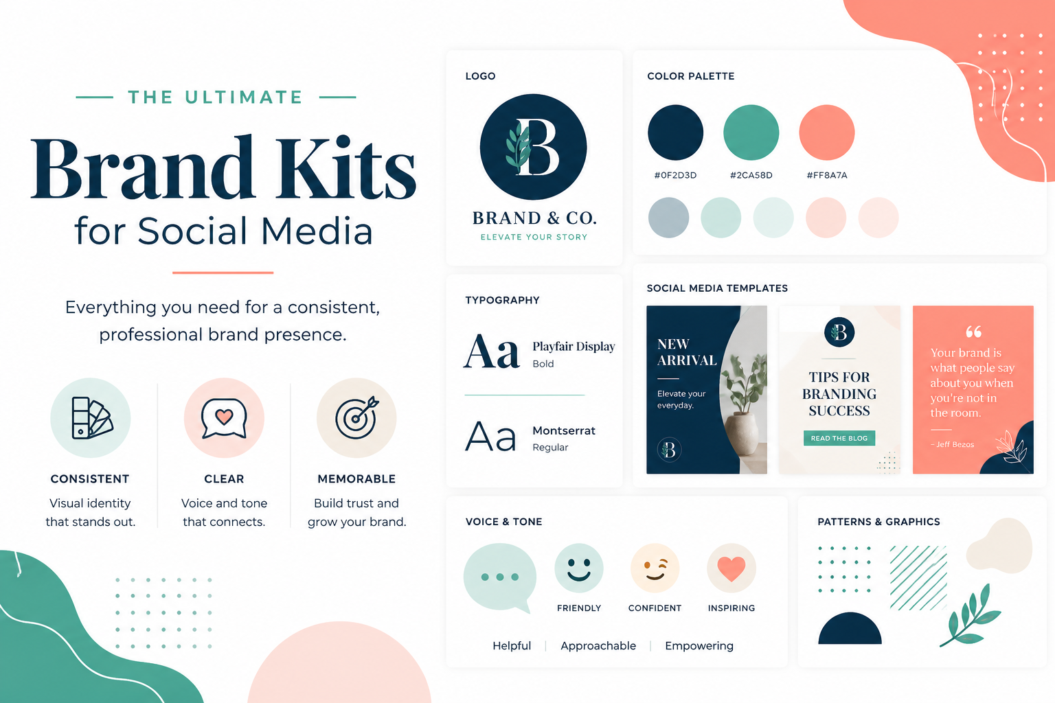

When you look through a brand’s social media, have you noticed how everything seems to go together? That’s not just a coincidence; that is a brand kit working quietly behind the scenes.
A brand kit is a collection of rules and assets your team uses on a day-to-day basis. It includes elements such as brand colors, fonts, logos, and templates. With everything in one place, your team can configure how best to represent your brand online. When a brand kit is adopted, social media posts convey a consistent brand rather than a collection of random, uncoordinated assets.
What Goes Into a Brand Kit?
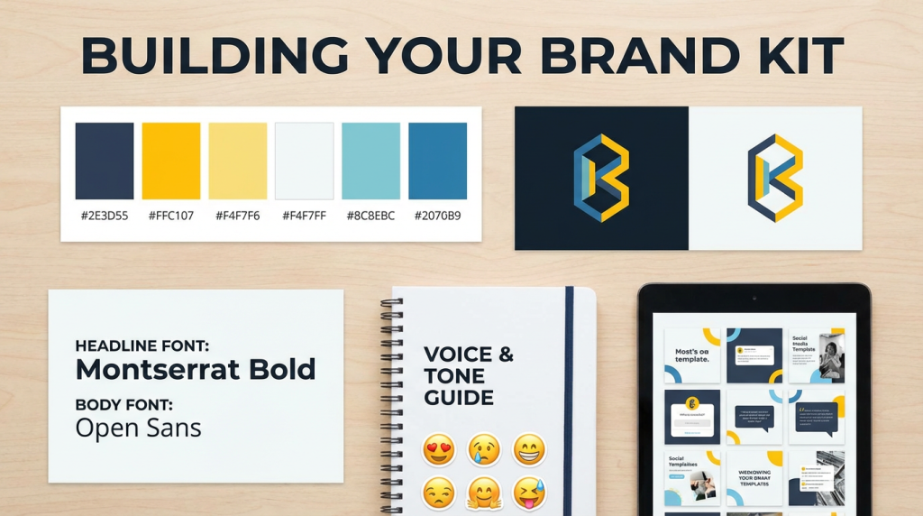
Colors
Pick two or three main colors that match your brand. Add a few support shades, too. Save the hex codes for each one so your team does not need to guess the right shade. That single move can cut down on a lot of back-and-forth.
- Show color swatches so everyone can see the exact colors.
- Say when each color should be used, such as strong shades for headers and softer ones for backgrounds
- Make sure your color pairings are easy for everyone to read
Your Logo
Your logo is your face online. Save it in a few file formats so it stays sharp on any screen. Keep a few versions ready. One for dark backgrounds. One for the light ones. And please, don’t stretch it or flip the colors. That kills the look fast.
Fonts
Stick to one or two fonts. That’s it. One for headlines and one for body text. Write down the sizes too. Staying consistent here makes a big difference in how your content looks across every post.
Voice and Tone
This part gets skipped a lot. And that is a big mistake. Your brand kit should explain how your brand talks and not just how it looks. Are you fun and casual? Sharp and polished? Write it down so anyone creating content knows what to do from day one.
A few things to nail down:
- Do you use emojis? Which ones feel right for your brand?
- Are you cool with slang, or do you keep things clean?
- How do you handle hashtags? A few focused ones or a bigger stack?
And so getting this right means a new hire or a freelancer can write your captions and still sound like you. That’s a huge win for your brand.
Templates
Templates save time! Build them for posts you share repeatedly, such as promos, quotes, team news, and new product releases. A pre-made template with your colors and fonts will work perfectly.
That said, be careful not to rely on templates too much. You don’t want your posts to all look the same. Things like platform updates can impact how your posts are displayed. For example, when Instagram switched to a 3:4 ratio in 2025, templates designed for a square crop ratio looked wrong.
Extra Graphics and Photos
Small details build a stronger feed – Icons, Patterns, and Shapes. These added elements help everything feel more connected. You need to keep a shared folder of your main design pieces so the team can grab them whenever needed.
Photos can also carry a lot of weight. Pick one visual style and stay close to it. You should also choose early and stay steady. That is how your feed starts to feel like a brand instead of a random mood board.
Start Simple. Stay Consistent.
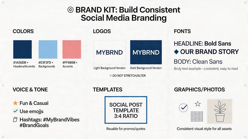
You could create a single document that provides some structure, though even a one-page brand guide is better than having no guidelines at all. Start with some brand colors, a couple of fonts, and some templates. You will have more as time goes on.
The goal is simple. Anyone who posts for your brand should look at the kit and know exactly what to do. This is when your brand starts to feel real, and in all honesty, that’s the whole goal.